Tuesday, December 15, 2015

Finals Extra Credit

http://petapixel.com/2014/12/01/6-types-photos-know-make/

a.     What did you see on the website, describe it in 2-3 sentences?

On this website, I saw different photos and the website described different tricks that can be done to take photos and how to do them. The website used different rules of photography to take their pictures than what I had learned.

b.     What did you learn?

I learned how to make a fake tilt and shift photo, how to make a forced perspective photo and how to make a long exposure landscape photo. The website also taught me how to make a digital infrared photo, how to make a double exposure portrait photo and how to make a 360 degree polar panorama.

c.     How did the site relate to photography?

This relates to photography by writing about really cool ways to take awesome pictures as well as displaying photos using the different techniques. the website also provides step by step guides about using photoshop and the camera to achieve the technique.


http://petapixel.com/2014/12/19/disorienting-beauty-spiral-staircases-old-abandoned-buildings/
spiral staircase with railing
a.     Why did you pick this photo?

I picked this photo because I loved all of the texture that is in it. I also find the different colorful lighting very intriguing since it adds a bunch of really cool colors to the photo.

b.     What rules of photography do you see in the photo?

In this photo, I notice the rule of viewpoint. The viewpoint is there because this photo would be nothing without it's really cool angle and the way the spiral was taken from above.
c.     Who took the photo?


Christian Richter took this photo.


http://blog.ted.com/how-to-create-a-killer-timelapse-with-joe-capra/
a.     Describe what you saw in the video.

In this video, I saw several time lapses that were all taken in the city Rio De Jenero. Some of the time lapses were taken during the day but many were taken at night showing all of the city lights.

b.     Try to figure out who made the video. If it was a photographer look them up on google and see if you can learn more about them.

Joe Capra made the video. Capra had been a photographer until he was inspired by a time lapse video and decided he wanted to create one himself.

c.     If there is a story about the video on the website, paraphrase it in 2-3 sentences.


d.     What did you learn new?
Monday, December 14, 2015

Final Exam Review

1. Captions


a. First sentence includes major information about the photo (who, what, where, when, why, how). You may make up the information for this assignment.

b. First sentence should be written in present tense as if the action of the photo is still happening.

c. Second sentence should be past tense, and should include background information.
d. Information in caption should not be obvious by looking at the photo.

e. If there are three or fewer recognizable people in the photo, you must give all of their names (you can make them up for this assignment).

f. Use strong action verbs whenever possible.


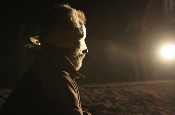
A blindfolded Palestinian arrested by Israeli soldiers in the Gaza Strip is brought to the Israeli side of the border near Kibbutz Kissufim.
Mat Damond sits blindfolded in a desert in Syria before he is murdered my members of ISIS.
He is being murdered because he is Jewish and is not like his other Muslim peers.

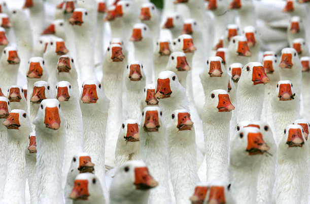
Geese crowd their open-air enclosure on a farm in Kuhhorst, Germany. The birds have been ordered for St. Martin's Day and Christmas.
Eurasian geese with distinct red orange noses and white feathers are gathered together in a great mass. These geese gather together as they travel south for the winter to try and escape the cold.

2. Rules of Photography

a. Rule of thirds - aligns the subject along one of the intersects of a three by three grid.
b. Balancing Elements - the effect of the subjects and things in the picture outweighing each other so that the picture seems even and balanced.
c. Leading Lines - the eye of the viewer is lead to the subject by lines in the photo.
d. Symmetry and Patterns (repetition) - photos that contain repetitive patterns and show visual rhythm and satisfaction and interest.
e. Viewpoint - the position from which the photo is taken or the subject(s) position in the photograph.
f. Background - the area of space behind of the subject.
g. Create depth - done by including objects in the foreground, background, and middle ground. 
h. Framing - the framing of the subject with the surroundings not a literal frame.
i. Cropping - the subject of a part of the picture is zoomed in on.
j. Mergers and avoiding them - awkward placements of subjects with the surroundings.

3. Aperture, Shutter speed, and ISO

Aperture - the unit of measurement that defines the size of the opening in the lens that can be adjusted to control the amount of light reaching the film or digital sensor

Shutter speed - the length of time when the film in a camera is exposed to light.

ISO - used when there is not as much light.

4. Photoshop

What is acceptable: Leveling and cropping of the photo

What isn't acceptable: Changing the photo to the point where it is unrecognizable, and changing the body features of subjects


5. Portraits


Environmental portrait - taken in the subject's usual environment.

Self portrait - taken of a single subject with a set up.

Casual portrait - a photo taken of a single subject


6. Photogaphic Terms 

Exposure:  the amount of light per unit area in a photo

Depth of Field: the distance between the nearest and furthest objects that give an image judged to be in focus in a camera.

Focal length: the distance between the center of a lens and its focus

7. Magazine Covers

Early magazine covers: consisted of a title, author, and occasionally a small illustration without relation to the content of the magazine.

Poster magazine covers: consisted of a large image lacking relation to the magazine taking up the whole cover leaving some space for the magazine title.

Married to Type magazine covers: consists of a general image in the center of the cover and the title as well as article names intended to draw the reader in along the sides of the image with matching font and colors.

Forest of Words magazine covers: obnoxious "shouting" text covering the cover with articles and their summaries as well as an image hidden behind the text and a title.

Monday, December 7, 2015

FASHION

Video 1:
In video 1, the model's eyes were widened, her neck was slimmed and elongated, her lips were plumped, her face was slimmed and her brow bones were moved down.

Video 2:
The model's eyes were widened, her shoulder was elongated, her stomach was slimmed, her legs were slimmed and elongated. her neck was elongated, her neck was slimmed, her hair color and skin color were changed, her face was blurred and perfected, her eyes were tinted blue and her stretch marks were removed.

Video 3:
In this video, the model was almost completely rid of all the fat on her body. The photoshopper slimmed her waist, her arms, her neck, her face, her legs, and her back.They even added hair to her head.

4. Is it ethically acceptable to change a person's appearance like these in a photo? Why or why not?

It is not ethically acceptable to change a person's appearance like the ones above. This is because it is an unreal, fake image of what society expects women to look like. No one looks like this and this fake image puts a pressure on girls and women to change themselves to look like this altered image.

5. Are there circumstances in which it would be more ethically wrong to do this type of 

manipulation?

It would be more ethically wrong to 

6. What types of changes are OK, and what aren't?


Types of changes that would be okay are the whitening of teeth, 


7. Explain what you think the differences are between fashion photography and photojournalism.

Fashion photography is different than photojournalism because in fashion photography, they are trying to sell beauty and the idea of perfection. Photojournalism is appealing to interest, reality, and the emotional effects of images. It focuses on the beauty of reality instead of a false beauty that is desired by society.

8. What relationship does each type of photography have to reality, and how does this affect the ethical practice of each?


When it comes to photojournalism photography, the photos usually portray an opinion or reality. Fashion photography portrays an image that attracts sales. These images sell.

9. Why do you think I am showing you these three videos?


You are showing us these videos because you want us to experience the truth of the reality of fashion photography.

10. Why are none of these videos about guys???


None of these videos are about guys because being the dominant sex in society, they are not pressured nearly as much as women and girls are to look "perfect" in the eye of society. Guys do not have to be "perfect" to sell.


Thursday, December 3, 2015

Tuesday, December 1, 2015

Cover Types


1. Early Magazine Covers

Early magazine covers tended to have more words than pictures. Magazine covers were very similar to book covers at the time and had little to no pictures at all on them. Some only had a tittle, publisher, and a small illustration without relation to the magazine while others had a title, publisher, and table of contents or description of the magazine.

2. The Poster Cover

The poster cover style of magazines mainly consisted of a huge picture and the tittle and publisher in small font. Magazine companies would choose a picture that may have slightly related to the magazine. The magazines felt that their one chosen cover picture expressed the magazine thoroughly when it really was not related to the articles in the magazine at all.

 3. Pictures Married to Type

This style of magazine covers insures that the words and picture of a magazine are paired together for maximum desire to the eye. Magazines find a way to design the cover lines of articles to cohesively go with the cover art or picture on the magazine. With this style of magazine, a reader or passerby can quickly get a glimpse of what the magazine features to see if their interest in purchasing a magazine is sparked.

 4. In the Forest of Words

The in the forest of words magazine style boasts lots of big words and as well as a cover picture and the name of the magazine. Unlike pictures married to type, the attention of the reader is more so directed to the cover lines than the cover picture itself. To the reader, the magazine cover's cover lines are almost shouting, commanding attention to themselves to turn heads and spark interest in the possible buyer of the magazine.

My Favorite Cover

Favorite
Description: "For our August 2014 issue, FamilyFun commissioned photographer Sabrina Helas to shoot our cover story on family road trips. The minute we saw this image in the film, we knew we had our cover. Shot at The Corner Store in San Pedro, CA, the photo is filled with the kind of joyful, authentic details we love — the vintage blue bottle, the candy bracelet, the world's best burger, and a side-glancing smile of delight from 6-year-old Isaac. Intriguing and spontaneous-feeling, it sums up what our brand is all about: making happy memories with your kids." - See more at: http://www.magazine.org/asme/magazine-cover-contest/past-winners-finalists/2015-winners-finalists#sthash.uP58Y4Hm.dpuf
Critique: I really liked this photo because it gave me a sense of well being. There is natural lighting which will make any photo pop. The lighting and the colors of the picture go very well together. The scene is very colorful yet not too distracting that they take away from the subject which is the little boy. Also, the font and the colors of the words on the magazine suit the picture and the colors inside the picture very well. 80 The little boy in the photo is smiling and seems to be enjoying a burger, creating a warm and playful mood and since the magazine is directed towards families, suits the magazine perfectly.

Best Magazine Covers 2015

1.formal
2.formal
3.environmental
4.environmental
5.formal
6.formal
7.formal
8.formal
9.formal
10.informal
11.formal
12.formal
13.formal
14.informal
15.informal
16.formal
17.formal
18.environmental

Magazine Tips

When designing a magazine cover, you should be thinking about...

1. the image's appeal
2. arousing curiosity
3. the intellectual stimulation
4. if the magazine is worth the reader's money and time.